


From Good to Great: Unleashing the Power of Matrix Visuals and Custom Lines in Power BI
Good news, Microsoft decided to give developers more control over the formatting of the matrix visual and the formatting options for lines in several graph visuals! This was long awaited and probably initiated by much community feedback on these visuals.
The newly improvemented changes are very nice! The first changes in the Power BI May update start with an added option to select from three preset layouts for the matrix visual. Secondly they allow you to repeat row headers within the visual, and on top of that it is now possible to insert blank rows. The options to format your lines in any graph that includes lines is now also greatly increased. Lines can be hidden, their pattern can be completely customised, as can the gaps between dashed lines and finally you get more control over forecast-, leader- and reference lines.
More control with new features for matrix visuals
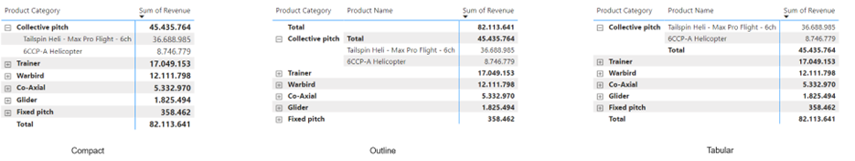
Let’s start by diving into the matrix visual changes, and we begin on a slightly critical note. The first change in the matrix visual is the addition of Layout presets, where you now have the choice between the Compact, Outline and Tabular presets shown below.
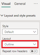
Using these layout presets is as simple as going to the format pane for your visual, expanding Layout and style presets, and choosing from the dropdown menu Layout.
Layout presets
The Compact layout is visually identical to the matrix visual before the May update, when the “stepped layout” option is turned on.
The Outline layout allows for more control over row sub-header width and it adds an extra step if row subtotals are toggled on.
The Tabular layout is very similar to the Outline layout but the row (sub) totals are below the detail rows instead of above them.
Is this really new?
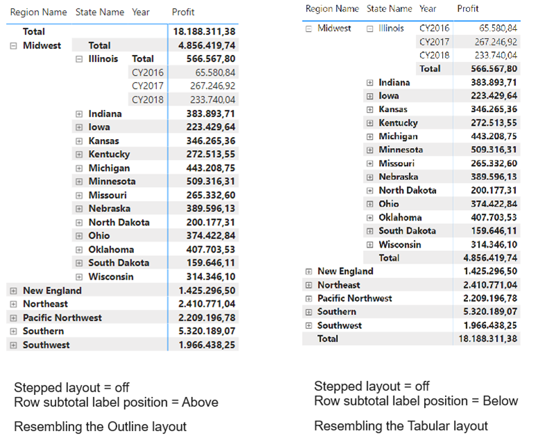
Despite Microsoft presenting these like new additions, I would argue that every single one of these layouts were achievable before the May update, and that only the way to achieve them has been simplified.
Using a Power BI version before the May update, toggling off “stepped layout” and choosing row subtotal label position “Above” you can recreate the Outline layout, and when choosing instead row subtotal label position “Below”, you get a layout that exactly resembles the Tabular layout. Both are illustrated in the below picture.
So in my opinion the layouts themselves are not exactly new, but the way to achieve them is simpler and together with the following two changes, the formatting of the matrix visual is now more in line with the formatting of a pivot table in Excel, which will be more intuitive for many users.
Repeating row headers
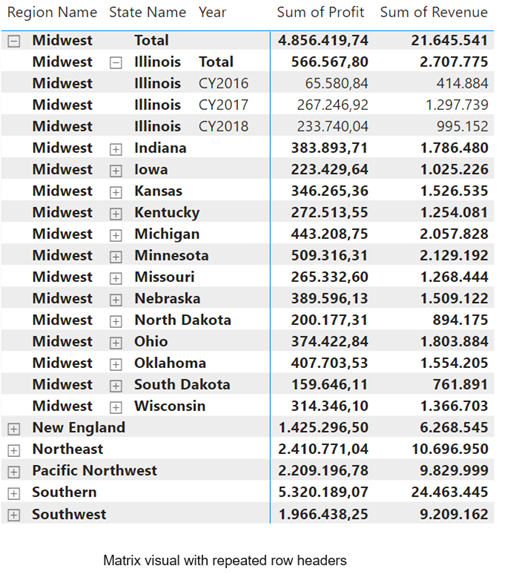
The next change to the matrix visual in Power BI is actually new and much called for by the Power BI community. It involves row headers being repeated on every row, such that it is easier to see which group a row of data belongs to and any data you would export is more useful for further analysis.
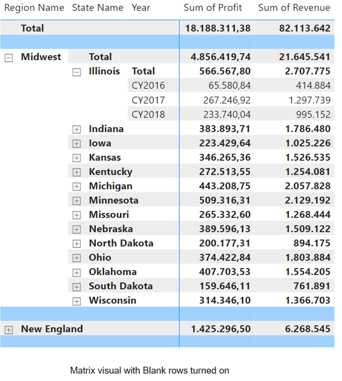
Blank rows
Finally inserting blank rows into your matrix enhances readability, and the ability to customise the colour and border of these blank rows makes in my opinion for a clearer and more visually pleasing matrix, as seen in the below example.
Besides giving you greater control over your matrix visuals, these changes make it more intuitive to format it, and finally in some cases might remove report consumer’s desire to export the data to Excel altogether, since you can create visuals that remind them of their trusted Excel pivot tables.
The following blog series is another good source for information about Power BI updates (6) NEW! Power BI Matrix layouts | LinkedIn.
Customizable lines
The next important changes to Power BI visuals are the added visual options for (data series) lines in graphs.
All these changes to line customisation can be found in the Lines submenu of the formatting pane for your visual, and will be explained in the following paragraphs.
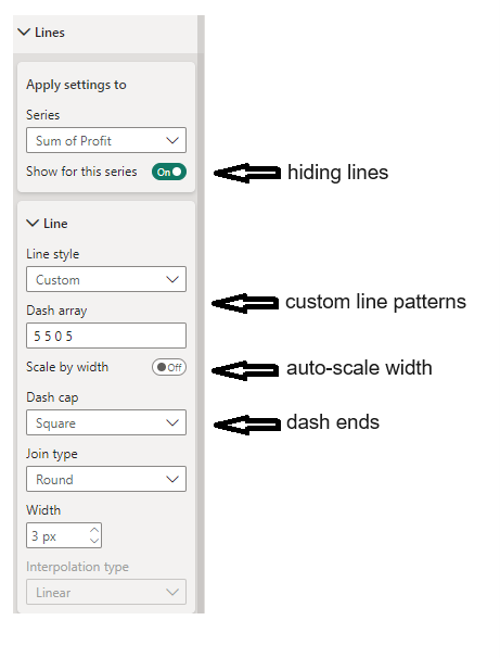
Hiding line series
The first addition is a toggle to simplify hiding/showing line series or all series at once. Furthermore, when you hide specific lines, while still showing tooltips and interactions with these hidden lines still possible, your visual may become less cluttered while still containing all relevant information.
Customizing line patterns
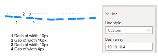
The biggest change lies in the addition of the custom option for line styles. Since this update you have complete control over the pattern of your lines, allowing you to set the width of each subsequent dash or gap for up to eight in a row.
To give an example, a sequence of 10 10 10 4 would yield the following line pattern:
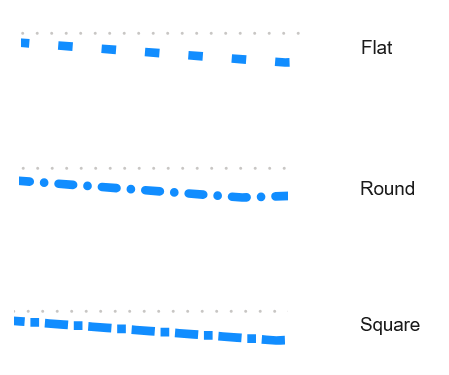
Not only can you change the dash and gap width, but after the new update you can also choose between three options for the ends of each dash. Below are the three options visualised.
The final addition to line patterns is the toggle for Scale by width, for which it is harder to tell what exactly it does. When turned on, your custom pattern is kept, but pixel width of both your dashes and gaps are adjusted based on the size of your visual. This means that the ratio of your dashes to gaps is kept the same, but the absolute pixel size is adjusted.
When combined, these last three changes make it much easier to distinguish between line series, and give you great control over exactly how you want your lines to look. Another great part to it is that these options are available for any type of data-line in any visual that can contain lines, including forecast lines and reference lines.
Also see (6) Additional enhancements for lines styles | LinkedIn for additional information about line changes.
Summary
Microsoft has added several new options for formatting the matrix visual and has made lines more customisable. In this blog I argue that not all of these additions are truly new, but a step is made to make formatting your matrix visuals more intuitive and more akin to Excel pivot tables.
Gaining greater control over the appearance of your visual lines not only enhances the distinction between line series but can also impress developers and report consumers who may have been previously underwhelmed. This demonstrates that Power BI has extensive capabilities and reassures users that Microsoft actively listens to community feedback to address any missing features.
To conclude, if you haven’t ensured you are working on the newest version of Power BI yet, now is the time to do so, as Microsoft continues to work hard to improve it with every new update.
If you have questions or remarks, let us know!
Also read the following blog for many best practices in Power BI Powerdobs Best Practices for Power BI – Powerdobs
Microsoft’s own update blogs Power BI May 2024 Feature Summary | Microsoft Power BI Blog | Microsoft Power BI